


Presented by FU Money Plan
Build more income. Reduce dependency. Create more options.
If you like practical ideas for building more income and more options, subscribe to FU Money Plan.
There’s a stage in almost every business when doing your own design makes perfect sense.
You’re figuring things out. You don’t know whether the business will work yet. You open Canva, make a banner, pick a couple of colors, throw together a logo and get on with your life.
Fine.
But eventually something changes.
Your experience gets better. Your offer gets stronger. You start charging more. Maybe you’re trying to win consulting work, attract clients, sell a product, get booked to speak, build a newsletter or find a better job.
Meanwhile, your LinkedIn profile still looks like something you cobbled together on a Sunday afternoon three years ago.
That’s when DIY starts getting expensive.
Because if you’re highly credible at what you do, but your profile makes you look amateur, people have to get past the presentation before they can discover the expertise underneath it.
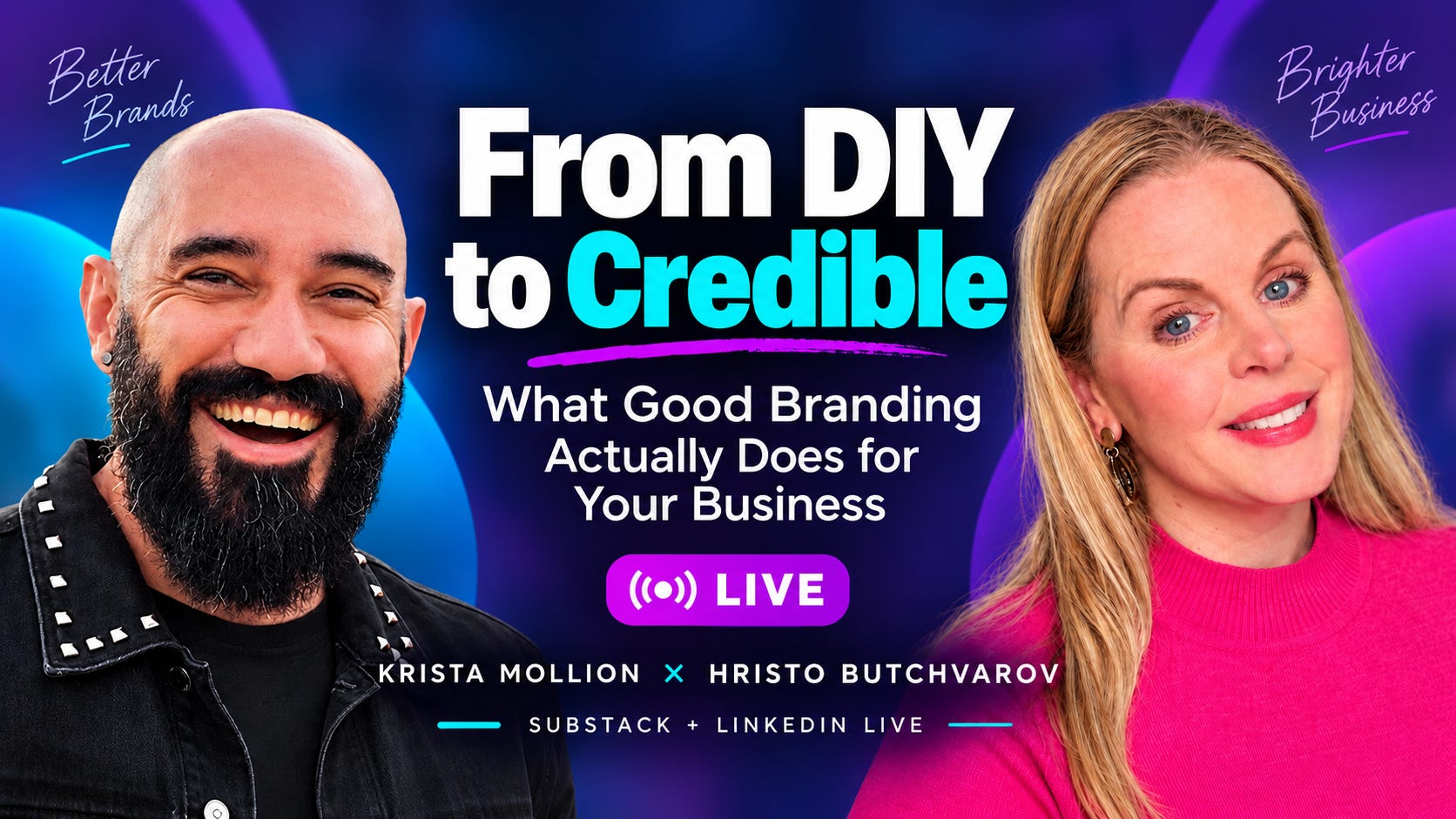
I recently talked about this with graphic designer Hristo Butchvarov I Design. You Grow. , who has been designing professionally since 2010 and says he has completed more than 10,000 projects through freelance platforms alone. He spent more than a decade specializing in infographics before noticing a shift in 2024: clients kept asking him to fix their LinkedIn banners, then their profiles, then their entire LinkedIn visual presence. Eventually LinkedIn rebrands became a bigger part of his work than infographics.
And the people coming to him usually aren’t beginners. They often have years of experience, plenty of proof and expensive offers. Their profiles just don’t look like it.
Your profile shouldn’t make people work this hard
Hristo described something I see constantly in marketing audits.
He lands on someone’s LinkedIn profile and has to inspect the banner, headline, About section and Featured section before he can figure out what the person actually does.
His clients often have the experience and the offer. What’s missing is clarity. The profile doesn’t communicate the level they’re operating at.
And yes, during our conversation I said that if you’re an experienced professional selling high-ticket work, you probably don’t want to show up with a design that looks like your six-year-old made it.
I stand by that. 😂
This is where I think people misunderstand professional design. They assume the purpose is to make everything prettier.
Pretty is nice. Pretty doesn’t pay the mortgage.
The job is to make what people see match the quality of what you actually do.
If I’m considering hiring you for a $10,000 engagement, your profile is giving me information before I ever read your case studies. I’m forming an opinion about how established you are, how much attention you pay to detail, whether you understand your own market and whether your business feels like something I can trust.
That may be unfair.
It’s also how humans work.
Give your banner three seconds
Hristo has a very simple rule for LinkedIn banners:
Someone should be able to understand what you do within about three seconds.
His advice is to stop trying so hard to sound clever. The banner should make it easy to understand what you do, who you do it for, what outcome you create and what the visitor should do next. He also recommends a clear call to action.
I’d add one more question:
Why you?
That’s where a lot of beautifully designed profiles still fall apart.
You can spend thousands on photography, fonts, brand colors and a gorgeous banner and then plaster this across the top:
Helping ambitious leaders unlock their potential.
Okay.
You and approximately 47,000 other people.
The designer can make a weak message look expensive. It’s still a weak message.
Hristo actually refuses to start designing a LinkedIn profile until the messaging is clear. He sends clients a questionnaire first so he understands their brand, goal, ideal customer and positioning. Only then does he start working on the visuals.
A branding problem is sometimes a design problem. Sometimes your design is accurately presenting a business nobody understands.
Fix that first.
Your LinkedIn profile actually has two jobs
One of the most useful things Hristo said during our conversation was that a LinkedIn profile works in two stages.
The first happens before anyone visits your profile.
They encounter you somewhere in the feed — perhaps through a post or a comment — and see a tiny profile picture and the beginning of your headline.
That’s it.
In stage one, the challenge is that photo and mini-headline should make them interested enough to click.

Then they enter stage two. Now they see your banner, complete headline, About section, Featured section and everything else you’ve built around the profile.
Now the challenge is to make them understand it in 3 seconds and like it enough to follow you.
Your branding doesn’t begin when somebody lands on your profile.
Your little round headshot is wandering around LinkedIn without you.
Every time you comment on someone else’s post, there it is.
This is one reason Hristo often puts a contrasting color behind a client’s profile photo and coordinates it with the banner. He considers the photo and banner parts of the same visual system, and the contrast helps the image stand out.
I’ve seen this myself. When you’re scrolling through a long discussion and nearly every headshot has a gray, white or neutral background, a bright orange or yellow background jumps out.
You’ve bought yourself a fraction of a second of attention.
Sometimes that’s enough.
Your face is part of the trust equation
I asked Hristo why he often puts another photograph of the person inside the banner when LinkedIn already has a profile photo.
His answer was that he doesn’t do it every time, but faces naturally pull our attention. The person becomes a visual hook before we begin reading the text.
I think there’s another reason this is becoming more important.
We are operating in a growing trust deficit online.
AI can produce the headshot, article, infographic, comment, testimonial-looking graphic and polished company copy. It can make a one-person operation look like a multinational corporation before breakfast.
People are getting more suspicious about what’s real.
So I’m increasingly interested in human signals.
Show your face. Look like yourself. Smile. Let people see your eyes. Give them some indication that there is an actual person behind the business.
Hristo told me he recently changed his own LinkedIn photo from a more serious pose to one where he was smiling because he wanted to appear more approachable and easier to work with.
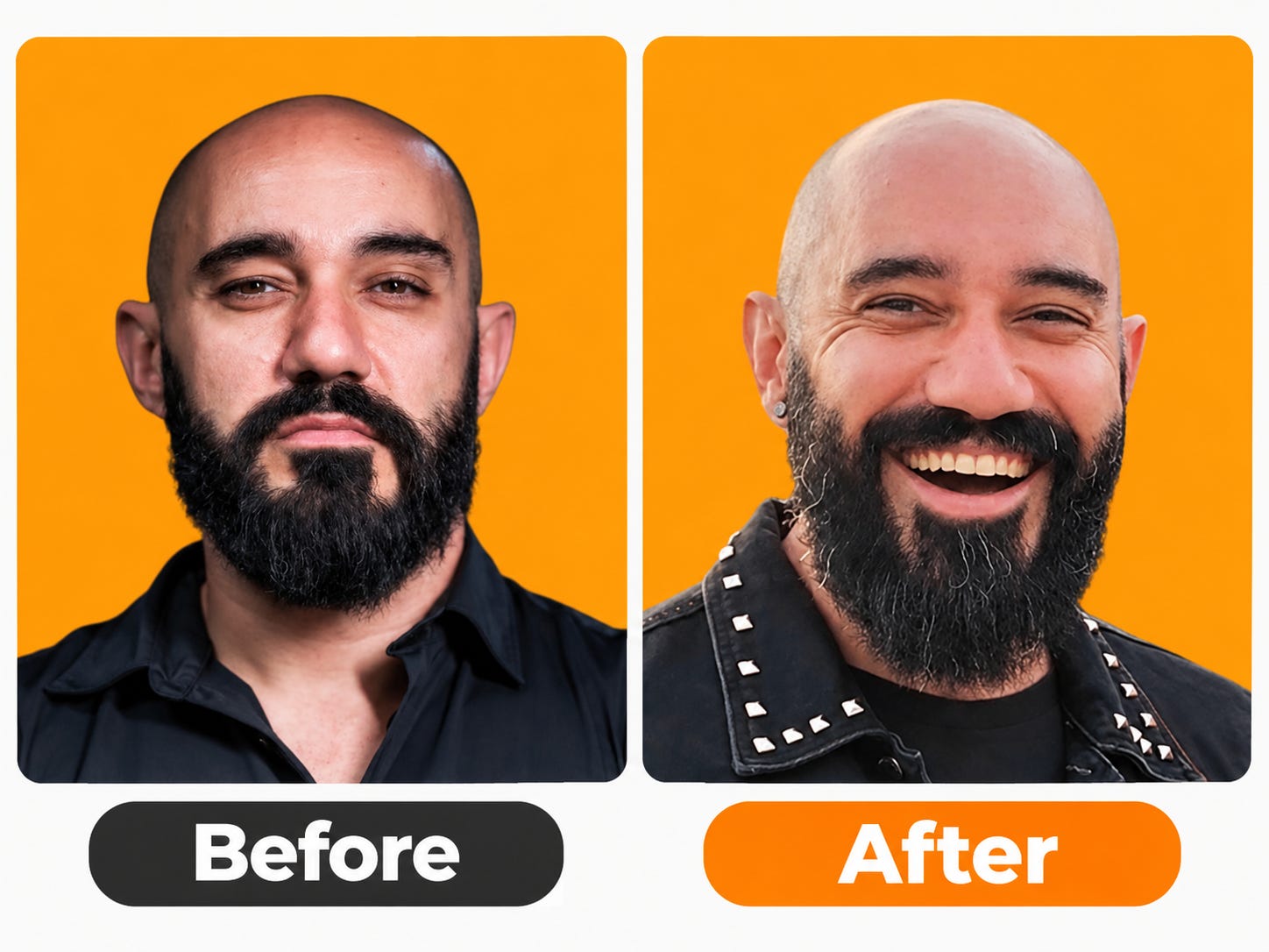
That sounds like a tiny decision.
For a service business, “Would I want to spend an hour on Zoom with this person?” is a perfectly legitimate part of the buying decision.
Treat your Featured section like a storefront, not a trophy cabinet
Then we got to one of my LinkedIn pet peeves: the Featured section.
People tell me they want clients.
I open their LinkedIn profile.
Their Featured section is empty.
Or it contains a post from 2024 that got 1,700 likes.
The featured section should tell the visitor: What exactly am I supposed to do next?
Hristo describes the Featured section as his “online store.” His recommendation is to keep it focused — generally no more than three important destinations — and use it for things that can actually move someone forward to connect with you off of LinkedIn:
a website,
offer,
booking link,
newsletter or,
for someone job hunting, a CV.
I love that framing.
Someone discovers you in the feed. They click your profile. They like what they see.
Now what?
Because their phone rings. Their kid needs something. A Slack message pops up. They close LinkedIn.
Tomorrow they vaguely remember that they saw “some interesting woman who did something with marketing.”
Fantastic.
Give people somewhere to go while you still have their attention.
I’d also account for different levels of buying intent. Someone who met you 90 seconds ago may not be ready to book a €5,000 engagement. That’s where a useful newsletter, assessment or quiz can earn the next interaction.
Personally, I’m much less excited about another downloadable PDF called 17 Secrets to Whatever. We’ve all downloaded enough PDFs to populate a small digital landfill.
I’d rather give someone something interactive that produces an immediate result.
The point is to continue the relationship outside your profile.
Make LinkedIn and Substack one engine
Hristo’s experience with Substack will probably sound familiar to anyone trying to use more than one platform.
He joined, started posting regularly, got some traction, then stopped. Between LinkedIn, client work and everything else going on in his life, Substack had started to feel like another job.
When he came back, he approached it differently. His goal now is to make LinkedIn and Substack work as “one engine” instead of running two separate content operations.
I’m doing the same thing.
I have zero interest in doubling my workload because I happen to use two platforms.
A LinkedIn post can become the starting point for a deeper Substack article. A Substack article can turn into LinkedIn posts, Notes, clips and comments. This live ran on both platforms. Now the same conversation is becoming a video, this article and several shorter pieces.
LinkedIn also gives you an obvious bridge between the two: your Featured section.
Put your Substack publication there with a strong thumbnail. Someone discovers you through a post or comment, checks your profile, then has an easy way to join your newsletter. The traffic can move the other way too. I’m already getting LinkedIn connection requests from people who tell me they found me on Substack.
This is why I’m not very interested in debates about whether LinkedIn or Substack is the better platform.
They are different yet complimentary.
LinkedIn is very good at discovery. Substack gives people somewhere to spend more time with your ideas and, importantly, gives you a direct relationship with readers through email.
Use them together and reuse the work.
The article you’re reading is a pretty good example. It will live on both LinkedIn and Substack, came from one live conversation, and will produce several more pieces of content before I’m finished with it.
One conversation. Maximum mileage.
AI made mediocre design incredibly cheap
This part of the conversation became especially interesting because Hristo has watched AI affect his own profession.
His old infographic niche has been heavily disrupted. Ten years ago, if you wanted certain kinds of graphics, you needed someone who knew how to design them. Today you can generate piles of graphics almost instantly.
And for plenty of situations, “good enough” really is good enough.
The problem comes when everybody uses the same tools to produce the same look.
Hristo described AI-generated images as “the new stock images.”
He’s seeing the same fatigue with AI graphics that we’re already seeing with generic AI writing.
I think he’s right.
LinkedIn right now can look like Las Vegas met Los Angeles and they decided to build a Canva template together.
Too many fonts. Too many colors. Too many icons. Every centimeter fighting for your attention. Apparently white space has committed a crime and is no longer allowed.
Hristo pointed out that premium brands tend to go in the opposite direction: cleaner design, more restraint, more space.
That’s where professional design becomes more valuable, not less.
The availability of cheap design doesn’t eliminate the premium end of the market.
It makes the difference easier to see.
Good design is an amplifier
This was probably my favorite way Hristo described his work.
Good design is an amplifier.
A redesigned LinkedIn profile isn’t going to rescue a bad offer.
You cannot redo your banner, disappear for twelve months and then complain that LinkedIn failed to send clients.
Hristo was very clear about that. If you already have experience, an offer, a product, leads and activity behind the profile, stronger design can amplify what’s already there. Consistent colors and fonts also build recognition over time; he’s deliberately kept his own visual identity consistent so people can recognize his content while scrolling.
I’ve seen businesses spend enormous amounts on visual identity systems while ignoring the fact that their positioning is boring, interchangeable or confusing.
A beautiful beige website cannot save you from sounding exactly like everyone else.
Design and positioning have to work together.
So when should you stop DIYing?
I wouldn’t tell a brand-new freelancer with no customers to spend thousands on a giant brand package before they’ve proved anyone wants what they sell.
Use Canva. Test things. Change your mind. Make some ugly stuff.
But keep an eye on the point where your business has moved forward and your presentation hasn’t.
If you have real expertise, a defined offer, proof that you can deliver, and you’re asking people to trust you with meaningful amounts of money, DIY starts getting expensive when it makes your business look amateur.
That cost won’t arrive as an invoice.
It shows up in the person who clicks your profile and leaves.
The prospect who can’t immediately figure out what you do.
The potential client comparing you with someone whose business looks substantially more established.
The visitor who likes your work but has nowhere obvious to click next.
The years you spend becoming excellent at something while your public presence continues underselling you.
You’ve already done the hard part.
Make sure people can see it.
Watch the full conversation with Hristo Butchvarov
Stay In Touch
Follow Hristo:
LinkedIn: https://www.linkedin.com/in/hristo-butchvarov
Substack: https://substack.com/@hristobutchvarov
Website:
https://hristobutchvarov.vercel.app/#Hero
Follow Krista / FU Money Plan:
LinkedIn: https://www.linkedin.com/in/kristamollion
Substack: https://open.substack.com/pub/unignorablebrands
FU Money Plan: https://unignorablebrands.co/start-here
If you’re building a personal brand, growing on LinkedIn, selling expertise, or trying to make your online presence match the quality of your actual work, this conversation is for you.
Thanks for reading. I hope you enjoyed this conversation.
If you’re not subscribed to FU Money Plan yet, this is what you’ll get here: practical ideas for building more income, more leverage and more options using the skills and experience you already have.
We talk about how to reduce your dependence on one paycheck, figure out what you could sell, build visibility around your expertise, create income streams that actually fit your life, and make smarter decisions about where to spend your time and money.
The goal is simple: to make sure no single employer, client or platform has too much power over your life.
Subscribe if you want to build more ways to earn — and more freedom to choose what you do next.
This was a real pleasure, and I'm 100% sure that we need to do it again. We need to talk so many more things.
I really appreciate this because your LinkedIn profile is often the first place people decide whether your expertise matches the level of your offer. I love the reminder that good design is not just about making things look pretty; it should make your positioning, credibility, and value easier to understand. And I completely agree that the messaging needs to be clear before the visuals can really do their job. 💖